








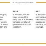


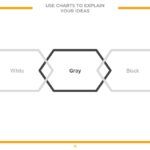
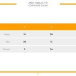




Choosing a stylish and bold template isn't just about aesthetics; it's a strategic decision. The design of a presentation directly influences how the message, brand, or idea you want to communicate is perceived.
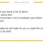
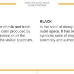
In this type of template, I have noticed that the color orange stands out a lot, a detail that is not accidental, since it is designed to convey confidence and creativity to your presentation, something key when you want to stand out without losing professionalism.
🎨 The perfect balance between elegance and daring
Achieving a design that is both elegant and bold is no easy feat. Many templates fall into the trap of being either too understated or excessively flashy.
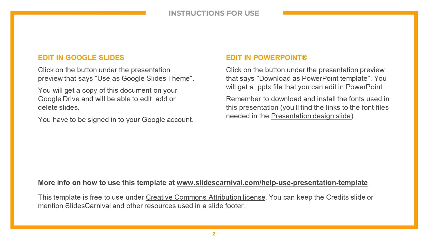
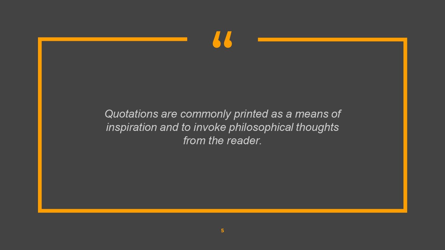
Here, the balance is very well executed. From the first glance, a polished, modern, and professional aesthetic is evident, reinforced by the fact that this elegant and bold PowerPoint and Google Slides template prominently features orange, a color that adds character without disrupting the visual harmony.
🧠 The power of the color orange in professional presentations
Color plays a fundamental role in visual communication. In my experience analyzing templates of this style, the well-applied use of orange is a great advantage.
It's not just about an eye-catching color; it's designed to convey confidence and creativity in your presentation, making it a great choice for innovative projects, business proposals, or creative presentations.
🔄 Compatible with PowerPoint and Google Slides
A good template should be versatile. This stylish and bold template for PowerPoint and Google Slides allows you to work comfortably on both platforms without losing design or structure.
I have found that when a template maintains its visual identity — as happens when the color orange is very prominent — the final result remains intact in both PowerPoint and Google Slides.
📌 What type of presentations is this template ideal for?
This stylish and bold template works especially well for:
- 💼 Modern corporate presentations
- 🚀 Creative projects
- 📊 Business proposals
- 🎯 Branding and marketing
- 🎓 Trabajos académicos con enfoque visual
En todos estos escenarios, el diseño cobra protagonismo y nuevamente destaca que está pensada para transmitir confianza y creatividad a tu presentación, algo que se percibe desde la primera diapositiva.stá pensada para transmitir confianza y creatividad a tu presentación, algo que se percibe desde la primera diapositiva.
🆚 Differences compared to traditional templates
Unlike classic templates, this proposal:
- It is not monotonous
- It doesn't overload the design
- It maintains a consistent visual style.
- Communicate personality
The strategic use of color, especially when the orange color stands out a lot, allows the presentation to be memorable without being excessive.
🎓 Ideal for students and creative professionals
Both students and professionals find this template a powerful tool. You don't need to be a designer to achieve an attractive result.
From my analysis, the fact that in this elegant and bold style template for PowerPoint and Google Slides the color orange stands out a lot makes it easier to convey ideas with confidence, dynamism and a careful aesthetic.