






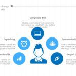
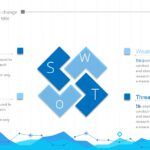

Working with data isn't the problem. The real challenge begins when it comes to presenting it clearly, visually, and convincingly. For a long time, I've seen good ideas lost due to confusing or poorly structured slides.
That's why, when I work with a well-designed statistics PowerPoint template, the difference is immediate. A good template not only enhances the presentation: it saves time, organizes the information, and conveys professionalism from the very first slide.
📌 Why using a statistics template in PowerPoint makes a difference
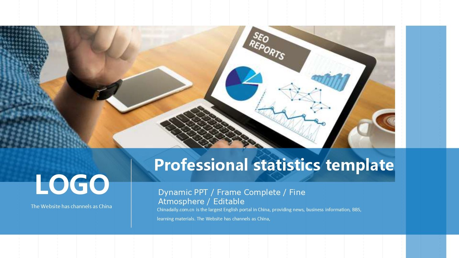
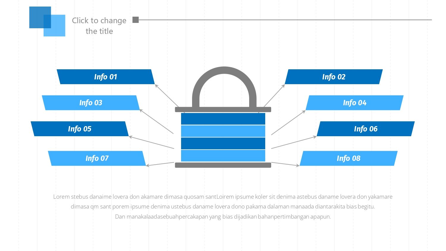
Statistics need visual structure. Simply pasting charts into the document isn't enough. In my experience, when a template is already designed for data, the process becomes much smoother. In fact, this resource includes 35 slides filled with 100% editable images and vectors, allowing you to move much faster without starting from scratch.
In addition, using these types of resources helps you to:
- 📊 Improve data understanding
- 🎨 Maintain a consistent design
- ⏱️ Reduce preparation time
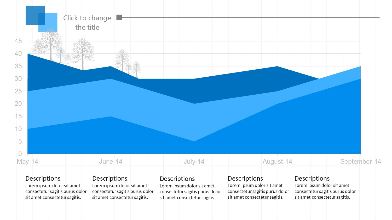
📈 Slides with statistical charts ready to edit
One of the biggest benefits of a statistics PowerPoint template is its complete visual kit:
✔ Bar charts
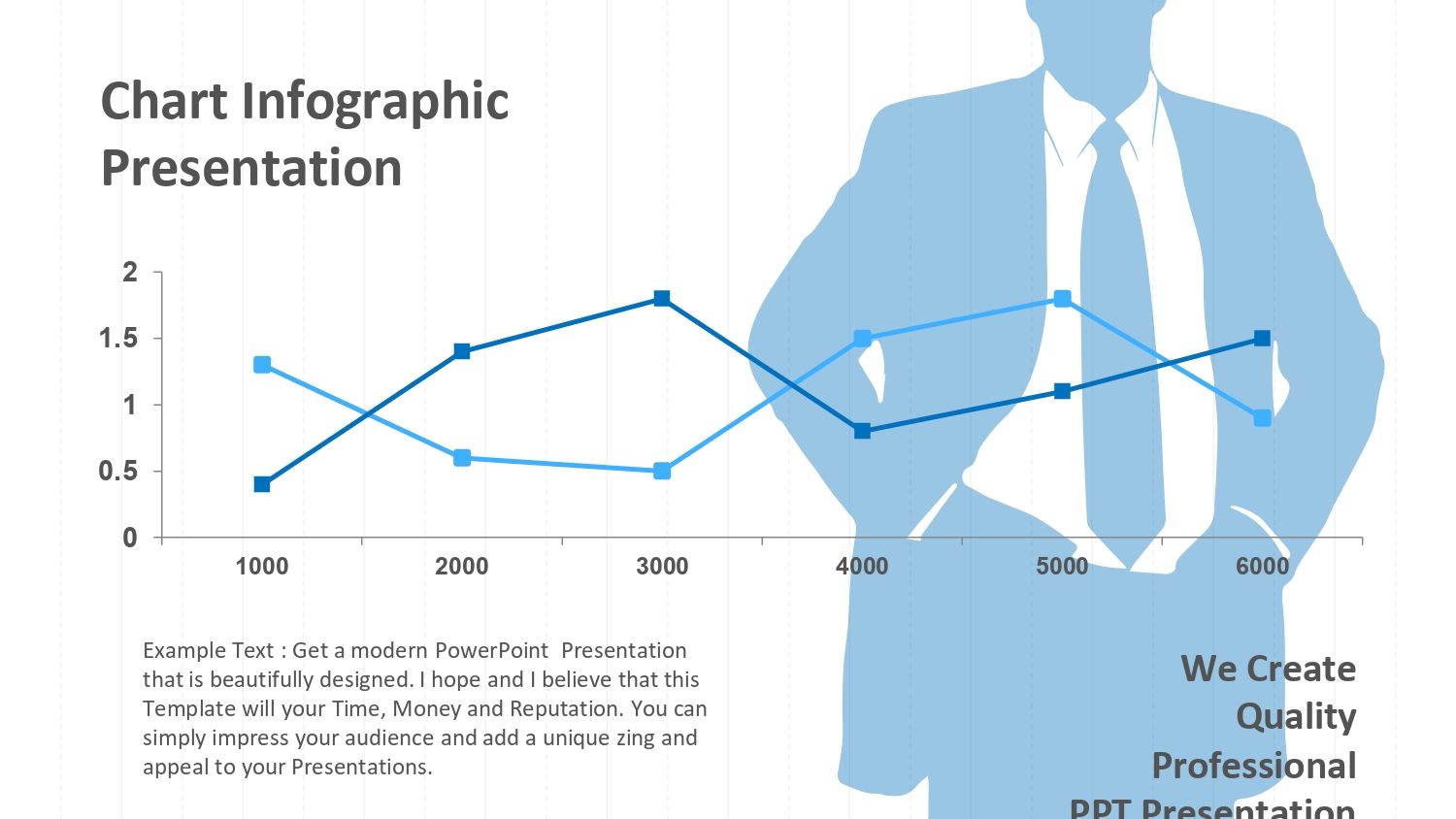
✔ Line graphs
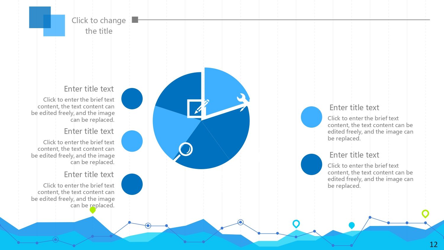
✔ Circular diagrams
✔ Comparative tables
✔ Fully customizable vectors
By working with slides that already integrate these elements, the time that was previously wasted designing is now dedicated to analyzing and explaining the data, something key when each presentation has tight deadlines.
👩💻 Statistical presentations for businesses, students, and professionals
These types of templates aren't designed for just one profile. They work equally well for:
- 🏢 Business reports
- 🎓 Academic presentations
- 📊 Financial analysis
- 📈 Marketing reports
- 📚 Research Results
I've found that when I use a well-designed template, even complex data becomes easy to understand. And when you also have 35 ready-to-use slides, it's easy to adapt the content to your audience without having to start from scratch.
🧠 Clear and professional data visualization
Data visualization isn't just about aesthetics; it's about communication. A good template guides the viewer's eye and highlights what's important.
What I value most is that the slides are intuitive and the graphics don't compete with each other. The fact that the images and vectors are fully editable allows you to adapt colors, sizes, and styles without losing quality, which is essential when seeking consistency with a specific brand or project.
⏱️ Real time savings on every presentation
One of the things I value most is time. Preparing presentations from scratch can take hours. However, when the resource already includes 35 slides filled with 100% editable images and vectors, the process is significantly faster.
This time saving translates into:
- 🧘 Less stress
- 📋 More focus on the message
- 🏆 Best final quality
And this isn't just theory — it's something you notice from the first time you use a template specifically designed for statistics.
📊 A practical solution for presenting impactful data
Using a PowerPoint template for statistics isn't just a visual matter; it's a strategic decision. It allows you to communicate data clearly, professionally, and quickly. When slides are already designed with editable charts, tables, and images, the work becomes more efficient and the result much stronger.