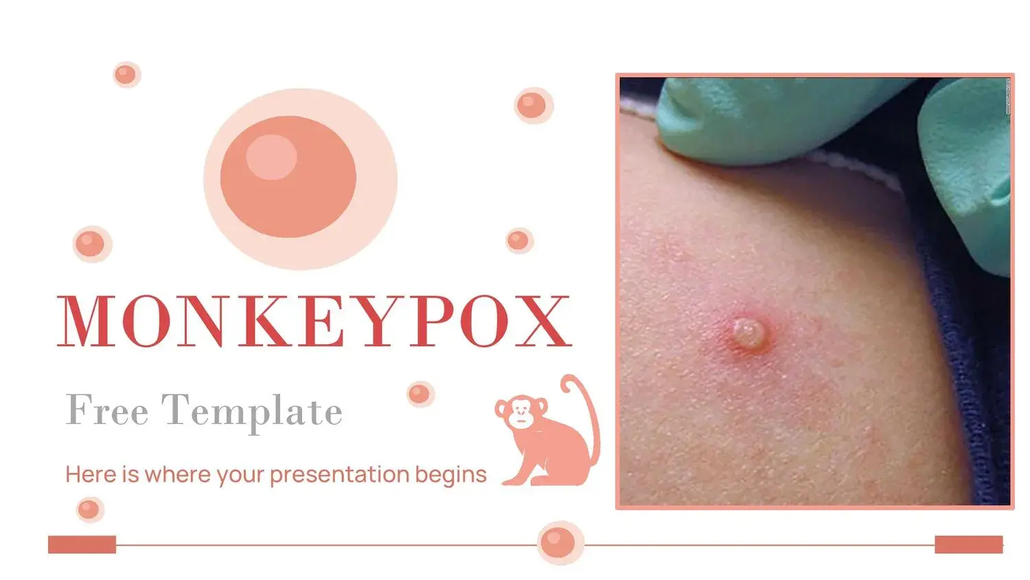















Presenting about monkeypox requires clarity, scientific backing, and a truly impactful visual structure. Simply showing data isn't enough; it must be organized, explained, and delivered with authority.
That's why, when I work on this type of content, I always look for a solution that combines rigorous medical information with professional design. And that's where a good template makes all the difference.
Because it's not just about pretty slides. It's about communicating public health accurately.
What is monkeypox and why is it relevant to include it in a presentation?
Monkeypox, also known as simian pox or monkeypox, is a zoonotic viral disease caused by the Orthopoxvirus genus.
Since the international outbreak reported in 2022, their study has gained relevance in:
- Educational institutions
- Medical conferences
- University presentations
- Public health exhibitions
- Academic projects
If you are going to present on symptoms, transmission, prevention or epidemiological evolution, you need a clear and professional structure.
Why choose a professional Monkeypox PowerPoint Template?
A medical presentation must fulfill three objectives:
- Report accurately.
- Organize complex data.
- To make a visual impact.
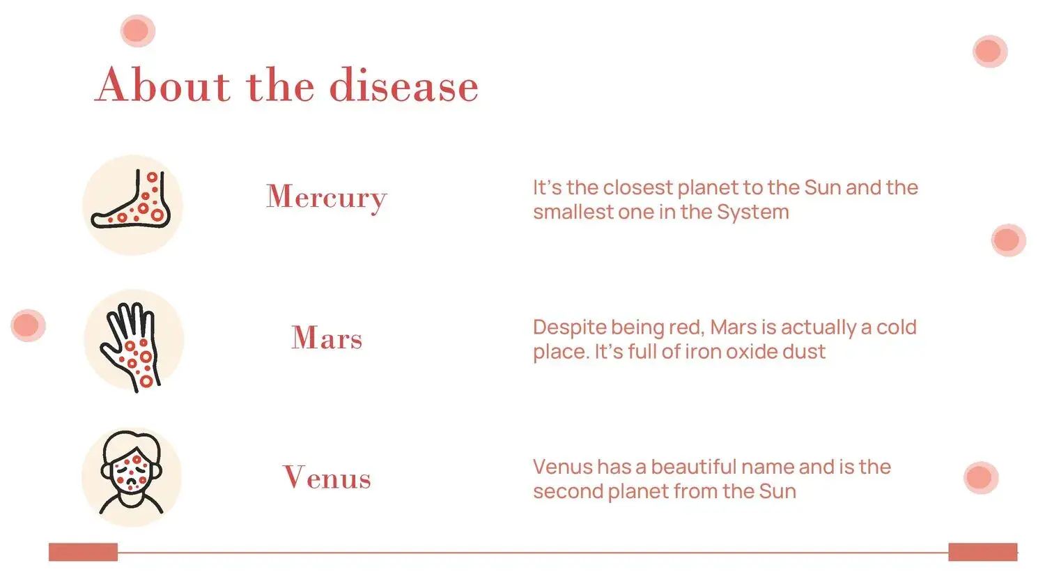
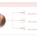
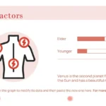
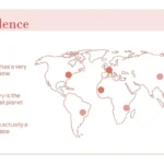
In my experience, what truly elevates a presentation is a template that includes comprehensive visual resources. And in this case, we're talking about its 34 slides with charts, tables, and timelines—perfect for creating a stunning presentation.
That completely changes the final result.
Qué debe incluir una buena plantilla PPT sobre la viruela símica
Para que una presentación sea realmente competitiva y profesional, debe integrar:
1️⃣ Epidemiological Introduction
- Origin of the virus
- First documented outbreaks
- Geographic expansion
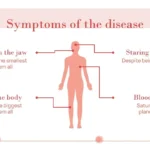
2️⃣ Symptoms and clinical manifestations
- Fever
- Skin rashes
- Swollen lymph nodes
3️⃣ Transmission mechanisms
- Direct contact
- Body fluids
- Contaminated surfaces
4️⃣ Prevention and health measures
- Isolation
- Hygiene
- Vaccination in certain cases
5️⃣ Statistics and time evolution
This is where charts and timelines make all the difference, especially when we're talking about outbreaks and international comparisons.
And I insist again: its 34 slides with graphics, tables and timelines, ideal for creating an amazing presentation, allow you to structure all this information without improvisation.
Advantages of using an editable template in PowerPoint or Google Slides
A professional template not only saves time, but also:
- Improves visual consistency.
- It maintains uniformity in colors and typography.
- It allows you to edit updated data.
- It makes it easy to insert recent statistics.
- It projects an image of academic authority.
When I prepare public health presentations, I always aim for the presentation to convey confidence, support, and organization. And a predefined structure greatly speeds up the process.
How to optimize your presentation to make it impactful
Beyond design, I recommend:
✔ Do not overload the slides with text.
✔ Use clear comparative graphs.
✔ Include timelines to show the evolution of the outbreak.
✔ Add summary statistical tables.
✔ Close with clear conclusions and preventive measures.
Here again, the importance of the template including comprehensive resources becomes clear. Because when you have 34 slides with charts, tables, and timelines, ideal for creating a stunning presentation, you can tailor the presentation to your audience: academic, medical, or general.
Who is this template ideal for?
- Medical students
- Nursing professionals
- Biology teachers
- Researchers
- Public Health Speakers
- University students who must submit scientific papers
It is also perfect for those who need to deliver formal projects with solid visual support.
Differences compared to generic templates
Many medical templates are visually appealing but lack a clear epidemiological structure.
A specific template for monkeypox:
- It's already contextualized.
- It includes logical sections.
- It makes it easier to organize scientific content.
- It allows you to insert updated data without losing consistency.
This reduces the margin of error and improves the final result.