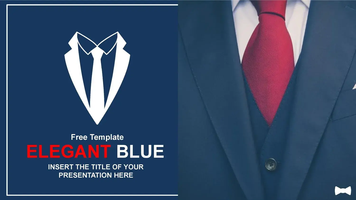














When I decided to work with an Elegant Blue PowerPoint Template, I quickly realized that I wasn't just choosing an attractive design, but a strategic tool for communicating with impact.
Blue conveys confidence, stability, and leadership. But when the design is also properly structured, the presentation ceases to be merely visual and becomes persuasive.
🎨 Why choose an Elegant Blue PowerPoint Template?
An elegant blue template is not simply a pretty background. It's a visual structure that guides the viewer.
From my experience, its 34 slides will be a perfect support for entering the requested information, because each section is designed to organize the content logically and hierarchically.
That's key.
When the design is done by professionals, you don't have to improvise about where to place graphics, titles, or conclusions. Everything flows.
In addition, a stylish PowerPoint presentation:
- Strengthen your credibility.
- Improves professional perception.
- It conveys order and clarity.
- Reduce design time.
🔷 The psychological power of the color blue in presentations
The color blue is not a coincidence in the corporate environment.
The world's largest companies use it because it generates:
- Feeling of security
- Professionalism
- Trust
- Intelligence
- Stability
That's why a professional blue template works so well in:
- Business presentations
- Executive reports
- Academic projects
- Thesis defense
- Commercial proposals
When I used this structure, I noticed that the audience perceived greater organization even before I began to explain.
📊 34 strategically designed slides
Not all templates include real variety.
In this case, what makes the difference is that its 34 slides will be a perfect support for entering the requested information, since they cover all the needs of a professional presentation:
- Striking cover
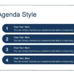
- Agenda or index
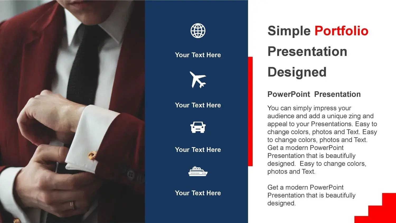
- Thematic development
- Charts and statistics
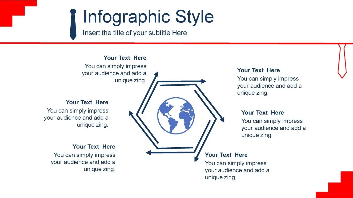
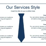
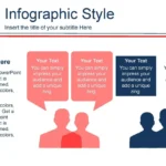
- Visual diagrams
- Conclusions
- Elegant closure
And most importantly: the structure is made by professionals.
This means that each slide respects margins, visual balance, and typographic hierarchy.
It's not just design, it's visual architecture.
🧠 Minimalist design that enhances your message
A truly elegant blue PowerPoint template applies the principle of “less is more”.
Here you won't find unnecessary elements or visual clutter. What you will find is:
- Strategic blank spaces
- Clean typography
- Appropriate contrast
- Harmonious use of blue
This allows the information to breathe.
Personally, I noticed that by not having to fight against the design, I was able to concentrate solely on the content.
Y eso cambia completamente la experiencia de creación.
💼 Ideal for corporate and academic environments
A stylish blue executive template is perfect if you need to project:
- Leadership
- Authority
- Security
- Professionalism
It works especially well on:
- Business presentations
- Financial reports
- University projects
- Executive meetings
- Formal exhibitions
And when you have 34 professionally structured slides, you can adapt the content without losing visual coherence.
That's something I deeply value: I didn't have to modify the structure, I simply integrated my information.
⚙️ Compatible, editable and ready to use
A good template shouldn't just be pretty. It should be functional.
This elegant blue template allows you to:
- Full PowerPoint Edition
- Usage in Google Slides
- Customization of colors and texts
- Easy insertion of charts
And again, the fact that the structure is made by professionals makes the experience intuitive.
You're not looking at a disorganized file. You're looking at a visual system designed to facilitate the organized entry of information.
🚀 Differences compared to other blue templates
Many blue templates look elegant, but they are not sophisticated in depth.
The real difference lies in:
- Typographic consistency
- Visual balance
- Strategic use of color
- Professional content distribution
In this case, those 34 slides actually serve as structural support. They are neither repetitive nor improvised.
And that shows when you project.
📈 How to get the most out of an Elegant Blue PowerPoint Template
To unlock its full potential:
- Don't overload the slides.
- Keep your sentences clear and direct.
- Use clean graphics.
- Respect the blank spaces.
- Maintain visual consistency.
Remember that the design is already optimized. Your mission is to respect that professional structure.