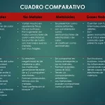

Gradient Style Comparison Chart PowerPoint Templates
Gradient style comparison charts in PowerPoint templates are a sophisticated way to present comparisons and contrasts in an attractive and effective way. With their combination of clear structure and visual aesthetics, these tools are essential for highlighting data differences in memorable ways. Experiment with these templates to take your presentations to the next level and captivate your audience with visual comparisons shocking.
Advantages of Using Gradient Style Comparison Charts in PowerPoint
- Visual Appeal: The transition of soft colors provides a stylized, striking and pleasing touch to the eye.
- Emphasis on Differences: The gradient highlights the variations and contrasts between data, making them more noticeable to the audience.
- Personalization and Adaptability: PowerPoint templates allow you to adapt and customize gradient comparison charts to reflect the style and theme of each presentation.
Features:
- It is 100% adjustable and easy to edit
- 2 different slides to impress your audience
- Designed to be used in Google Slides and Microsoft PowerPoint
- 16:9 Aspect ratio suitable for all types of screens
- You can edit it in Canva easily
COLORS:Green