






When I work on social, academic, or internal improvement projects within an organization, I always encounter the same challenge: How to explain a complex problem clearly and visually?
That's where a Problem Tree PowerPoint Template becomes an invaluable tool for communicating causes, effects, and relationships in a way that any audience can understand.
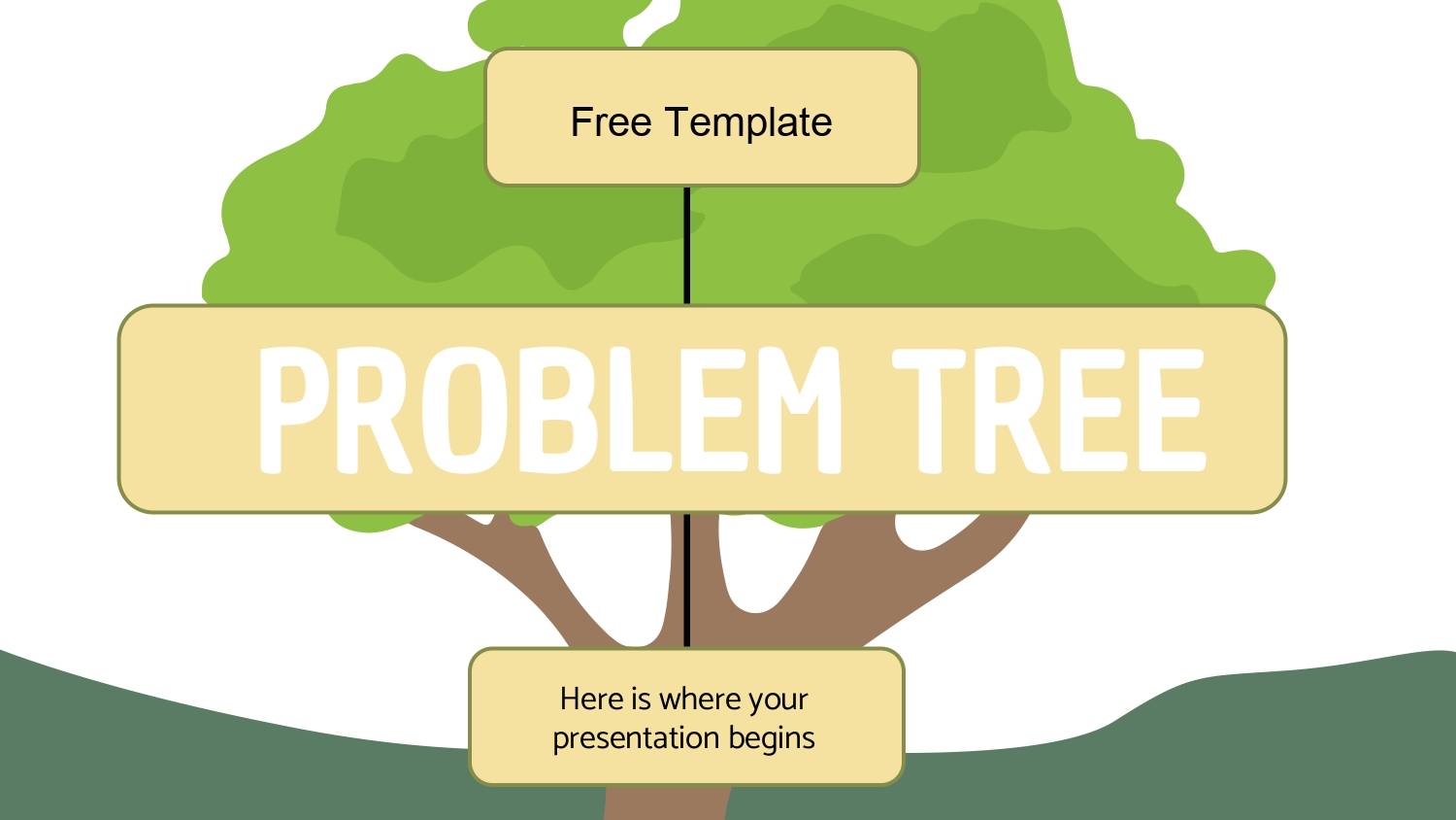
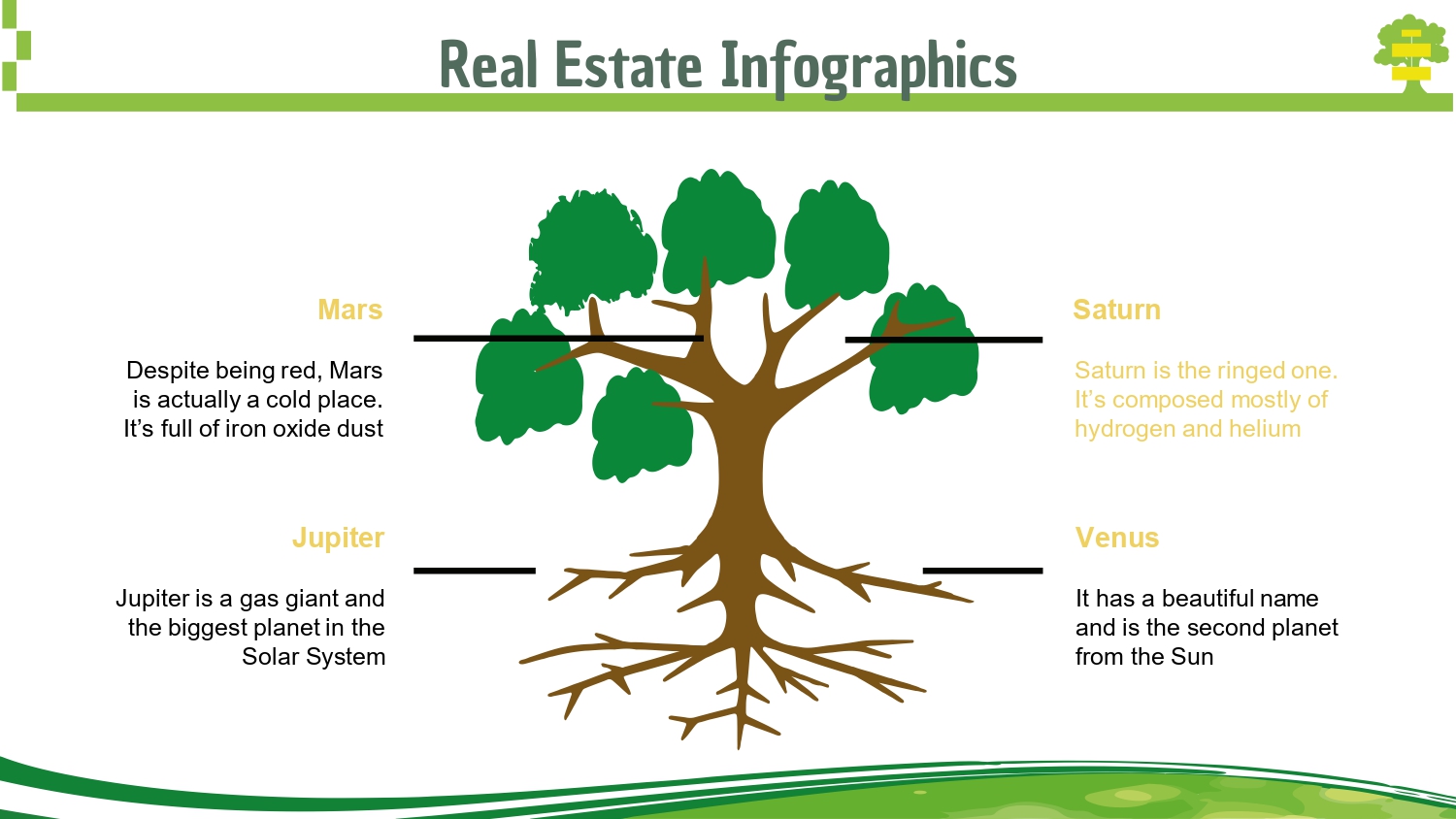
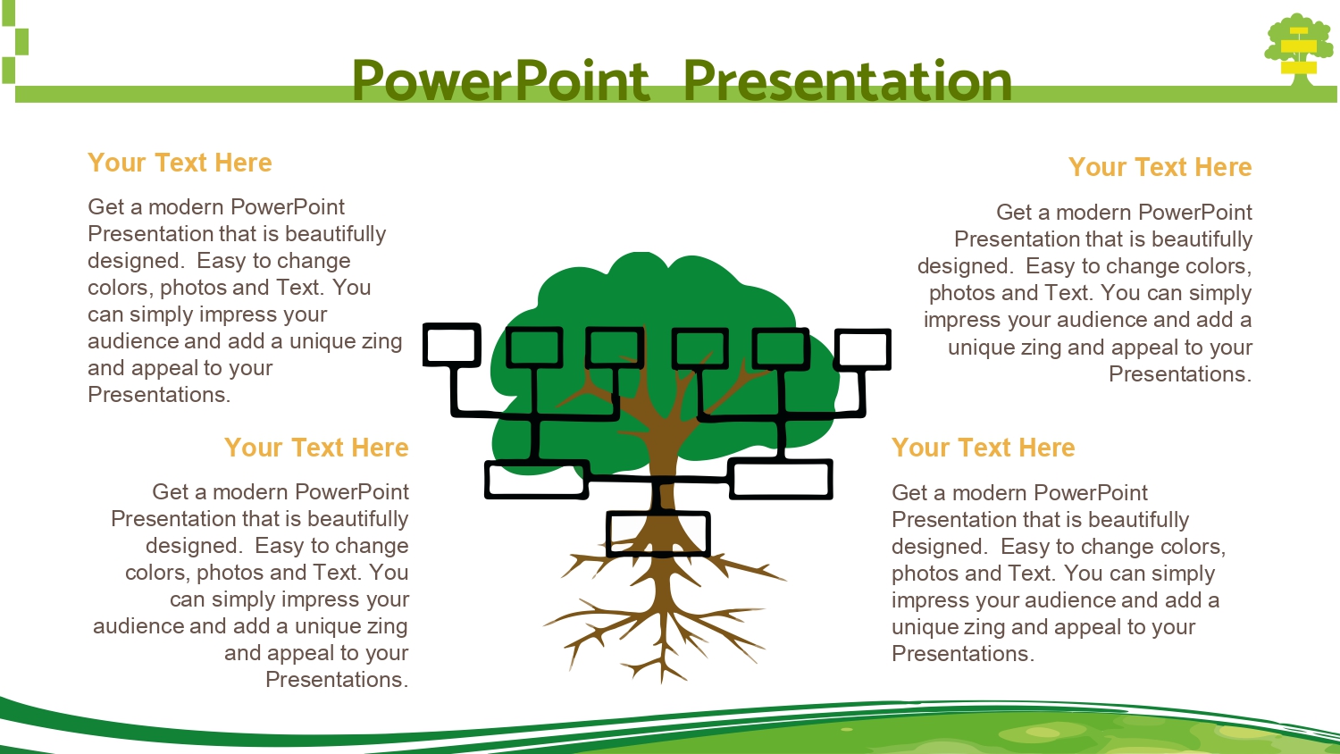
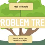
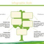
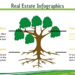
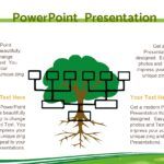
One of the first things that caught my attention is that the standout feature of each problem tree template for PowerPoint and Google Slides is its combination of images and background colors, because that visual mix makes even dense topics easy to follow and remember. That sense of clarity is what drives me to use these templates in almost all of my strategic presentations.
🌱 Why use a problem tree in PowerPoint?
A problem tree is not just a visual tool; it's a structured method that helps break down a situation, identify causes, and understand the impacts. When I bring it to PowerPoint, everything becomes more dynamic, accessible, and editable.
Furthermore, in every project I notice how the audience assimilates the information better when the design complements the explanation. The standout feature of each problem tree template for PowerPoint and Google Slides is its combination of images and background colors, and this harmonious combination ensures the presentation doesn't appear "flat," but rather visually appealing and very easy to understand.
🍃 A template designed to organize complex ideas
A good Problem Tree PowerPoint Template should help you to:
- Identify the core problem.
- Break down its direct and indirect causes.
- Show effects and consequences.
- Visually organize logical relationships.
- Generate a clear narrative for presentations or project reports.
I've tried many templates, and I always end up returning to those whose visual structure is designed to guide the viewer's eye. There, again, I perceive how the highlight of each problem tree template for PowerPoint and Google Slides is its combination of images and background colors, because well-integrated graphics make even an extensive analysis look clean.
🎨 Visual design: the secret to impact
Design is crucial when it comes to analysis. A well-presented problem tree can make the difference between:
✔️ a lost audience
✔️ an audience clearly guided to the correct conclusion
I've found that templates that use muted colors, clear contrasts, and subtle background photographs tend to hold the audience's attention. This confirms that the most striking feature of each problem tree template for PowerPoint and Google Slides is its combination of images and background colors—a small but crucial detail for the overall experience.
🧩 What should a professional template include?
A well-made template should offer:
🔸 Editable sections for:
- Main problem
- Primary causes
- Secondary causes
- Effects
- Future consequences
🔸 Graphic elements:
- Icons
- Marker lines
- Arrows
- Marcos
- Visual hierarchies
- Cause-and-effect diagrams
🔸 Additional advantages:
- Google Slides compatibility
- Ability to modify color, font and images
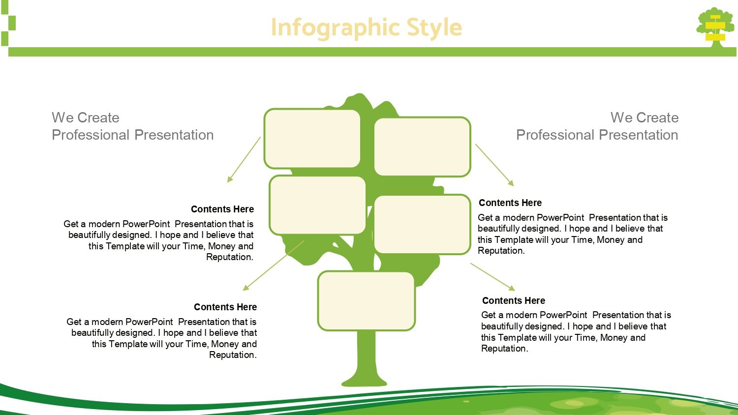
- Various versions of the tree (horizontal, vertical, mixed)
Often, while putting together these sections, I remember that the highlight of each problem tree template for PowerPoint and Google Slides is its combination of images and background colors, because that well-calculated design allows me to move faster without sacrificing aesthetics.
🌳 How to use this template in your presentation
Here's my personal formula:
1. I present the general problem
I show it centered and with a contrasting color.
2. Breakdown of causes and sub-causes
I go from the general to the specific using arrows and levels.
3. I explain short-term and long-term effects
I use soft background images to provide context.
Throughout this process, something I often repeat becomes evident:
the most striking feature of each problem tree template for PowerPoint and Google Slides is its combination of images and background colors, because it allows you to discuss serious topics with visual support that doesn't distract, but rather reinforces.